Background
Think Brownstone is a Design Agency that uses Basecamp for project management and communication with their clients. Our Challenge was to act as an agency for Think Brownstone, and create a Basecamp 2.0 that suits their specific needs.
Research
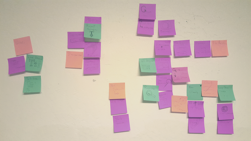
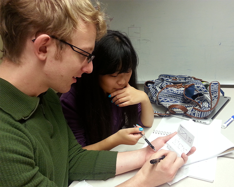
The first thing we did was interview Think Brownstone's designers about their use of basecamp. We all took notes and used affinity diagramming for analysis.
Based on our observations of basecamp and interview, we considered a variety of approaches:
• Integrating Slack/Join.me into Basecamp.
• Project Timeline for communicating process.
• Communicating the relationship between research and designs.
Problem Statement
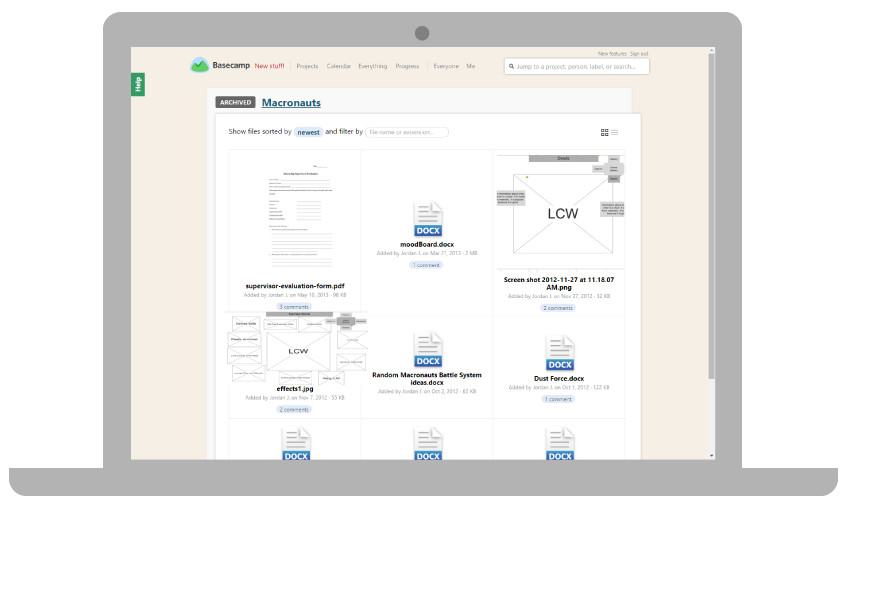
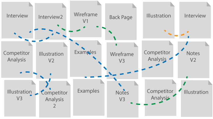
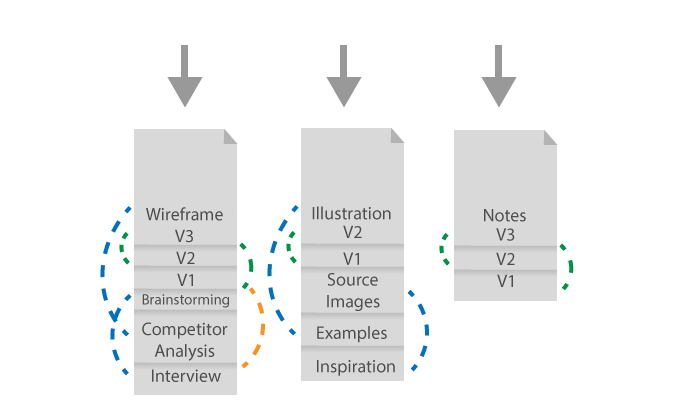
In current basecamp, the research is not well connected to the designs. Therefore, it’s hard for client to understand how research contributes to the design, and appreciate ThinkBrownstone’s effort and process. This problem grows larger and larger as the number of files grow.
Current Basecamp File System
Goal
Increase communication of relationships within projects between clients and the designers
Concept Meeting
Once we agreed on a direction, we split up to come up with ideas. In our next meeting, we selected a concept.

Concept
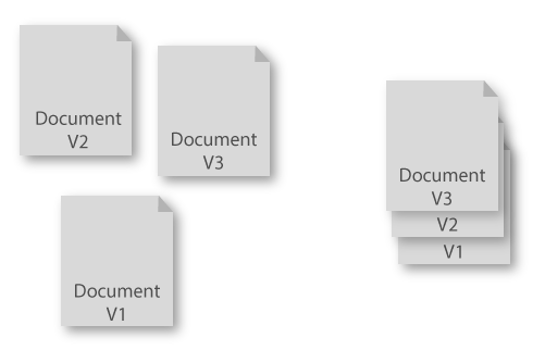
Organize the chaos of the current document folder Into stacks
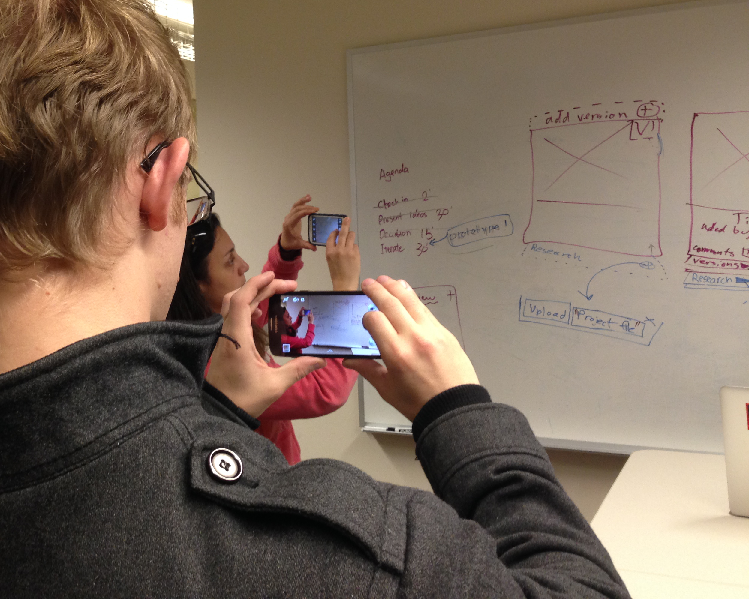
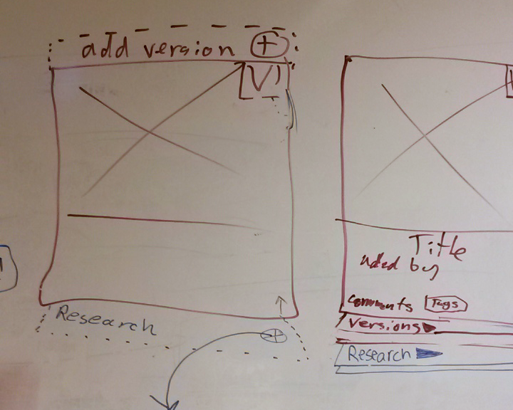
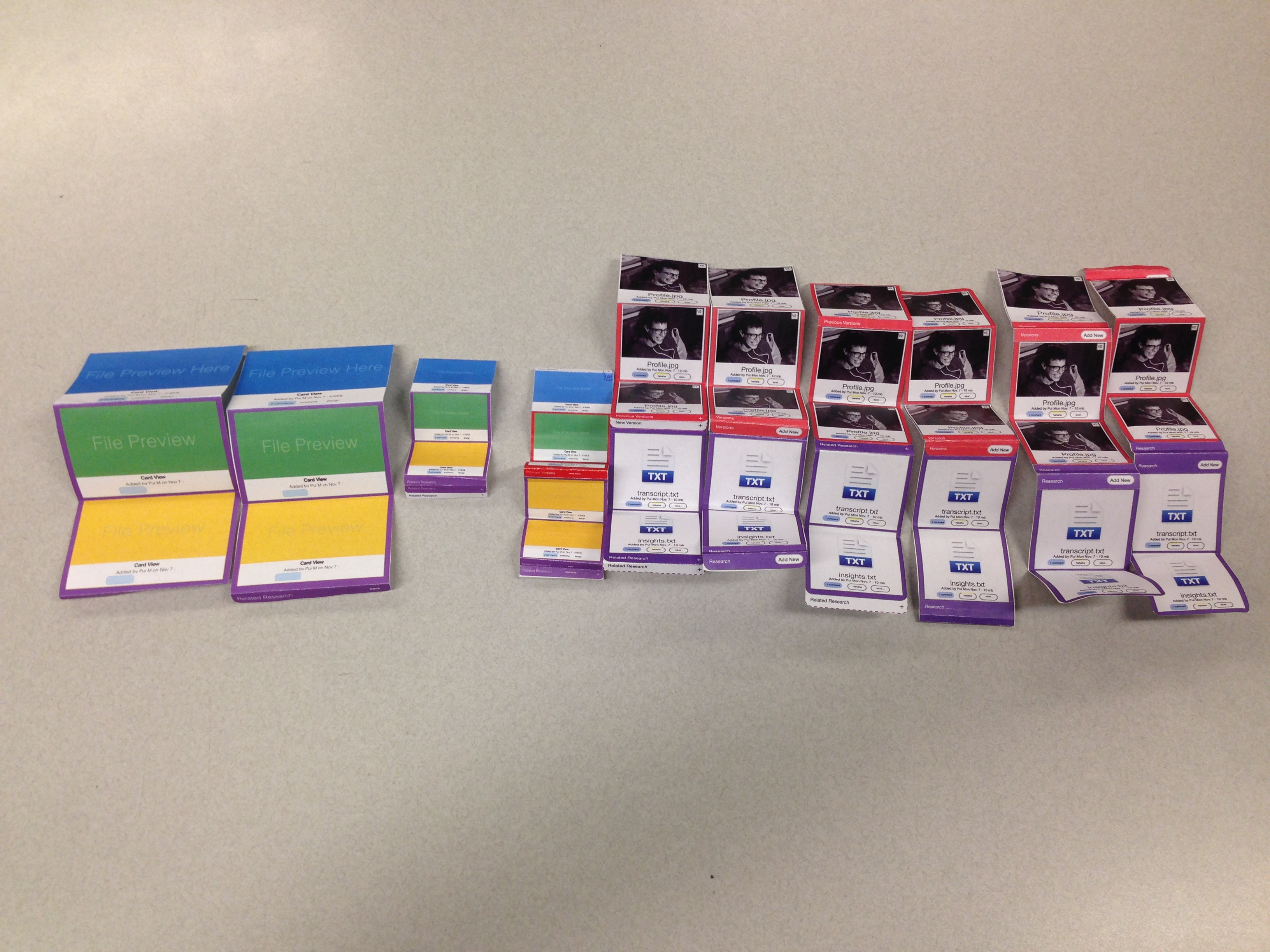
Wireframes
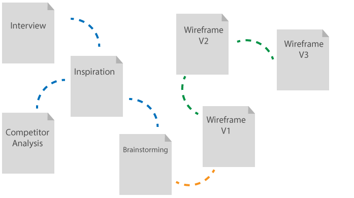
Before we mocked up high fidelity prototypes, we wanted to iron out some of the interactions. So I created many wireframes of possible interactions. Below are 3 key frames.
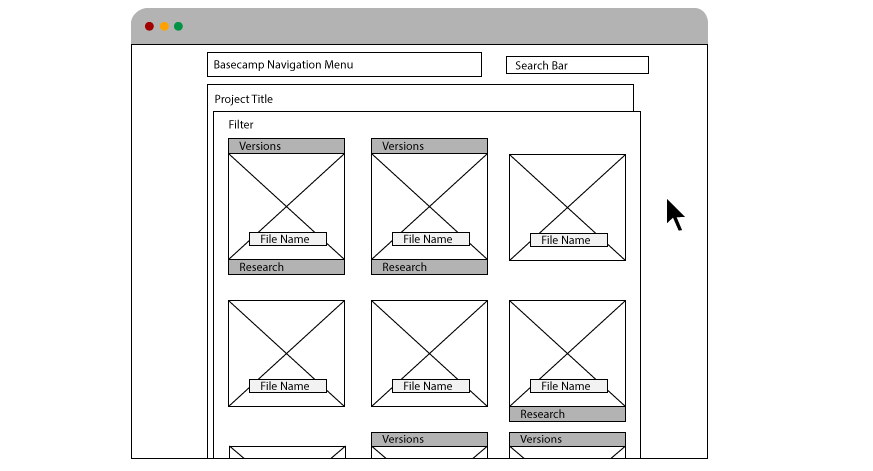
The first intention was to make it clear at a glance which files have versions/research attached.
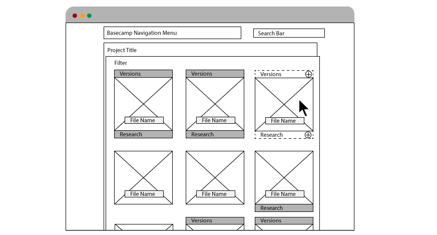
When the user mouses over an empty file, interaction cues pop up.
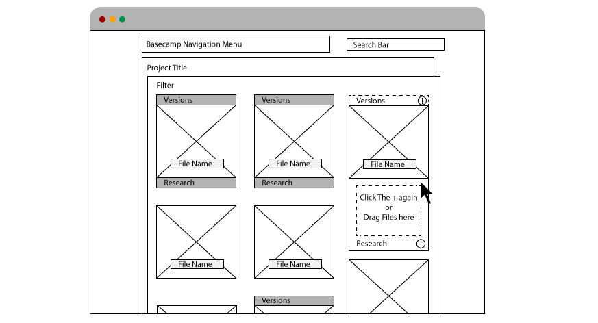
Once they click on one of the tabs, direct instructions guide the user.
Tested Prototypes
As they say "the devil is in the details", we went through many versions with small changes to make the interaction as intuitive as possible. All of these versions were tested with users/other designers.
Prototype Video
Scenario1
The user is a UX researcher who just finished transcribing a post-usability test interview. When he is done uploading the file, he attaches it to the V2 wireframe that he was testing
Scenario2
The user is the CEO of the client company and he is interested in seeing why they made changes to the V2 Wireframe that he liked so much. James goes to the V3 wireframe and inspects the supporting files.
Future Strategies
Given the 5 day period we had to deliver this project, we didn't have time to flesh out every detail of our design. With more time we would have directed our attention to the following areas.
• File Uploading as a time to link files.
• Research that applies to more than one design.
• Test the use of the feature over-time.
• Mobile Views.